How to create a responsive table in the blog is not mandatory to know, because not all contain require table.
For example, we want to create a table with two dropdown columns and two sideway columns.
Then we can write the table html code such as follow:
In the other way, we can also specify the width of table or column by using the px (example: 500px) or % (example: 100%).
A concrete example like this:
And the result is like this
Well, that's a glimpse of how to create a simple table that could be said has not been responsive.
How to Create a Responsive Table In Blog With HTML and CSS3 (Without Script)
Okay, let's go into how to create responsivetable, and here I will only discuss a tutorial on how to create a responsive table with HTML and CSS3 only.
Creating Responsive Tables in Blogger
For blogger users who want to create responsive table without a script, then please follow the steps below:
The CSS3 code to be installed is this
If you have known about how to put CSS code in blogger, you can put in the css code above to taste, for example, before the ]]></b:skin> code.
After installing CSS3 code above what should be done?
Next please create table on the desired post.
And to make the table become responsive, then type the html code to make it responsive as like this, for example:
Information :
But even so, I think it would be better if we know how to create a table in a blog.
Basically we can create a table on the blog only use html code, but sometimes we also need the help of CSS for styling the table.
Beside the style, this time a blog is required to have a responsive display, and it is not only about the blog display, but the contains of the blog are required to be responsive also, which means the existing tables on our blog should be responsive too.
To create a responsive table on the blog we can use the help of a script or it could be with CSS3.
Before we discuss more about how to create a responsive table on the blog, let me discuss a little bit about how to make a simple table using html code.

Basically we can create a table on the blog only use html code, but sometimes we also need the help of CSS for styling the table.
Beside the style, this time a blog is required to have a responsive display, and it is not only about the blog display, but the contains of the blog are required to be responsive also, which means the existing tables on our blog should be responsive too.
Then how do I create a responsive table?
To create a responsive table on the blog we can use the help of a script or it could be with CSS3.
Before we discuss more about how to create a responsive table on the blog, let me discuss a little bit about how to make a simple table using html code.
How to Create a Simple Table In Blog Using HTML
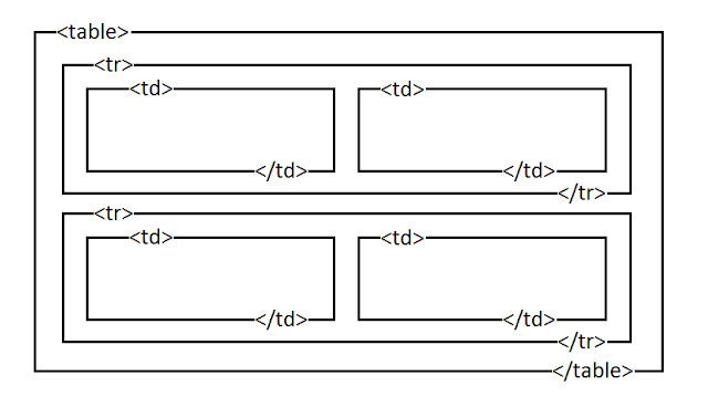
Actually, to create a simple table we only need a few of html code, namely:<table>and</table>code to wrap the entire table<tr>and</tr>code to make a drop column once wrap the sideway column area<td>and</td>code to create sideway column on the table and a place to fill the post.

For example, we want to create a table with two dropdown columns and two sideway columns.
Then we can write the table html code such as follow:
<table>
  <tr>
    <td>Text 1</td>
    <td>Text 2</td>
  </tr>
  <tr>
    <td>Text A</td>
    <td>Text B</td>
  </tr>
</table>
In the other way, we can also specify the width of table or column by using the px (example: 500px) or % (example: 100%).
A concrete example like this:
<table width="100%">
  <tr>
    <td width="50%">Text 1</td>
    <td width="50%">Text 2</td>
  </tr>
  <tr>
    <td width="50%">Text A</td>
    <td width="50%">Text B</td>
  </tr>
</table>
And the result is like this
| Text 1 | Text 2 |
| Text A | Text B |
Well, that's a glimpse of how to create a simple table that could be said has not been responsive.
How to Create a Responsive Table In Blog With HTML and CSS3 (Without Script)
Okay, let's go into how to create responsivetable, and here I will only discuss a tutorial on how to create a responsive table with HTML and CSS3 only.
Creating Responsive Tables in Blogger
For blogger users who want to create responsive table without a script, then please follow the steps below:
- Sign in to your blogger dashboard
- Open the Template page
- Backup first the blogger template that is being used
- Click Edit HTML
- Replace CSS3 code that I include below exact above the </head>
- Save the template setting
- Done.
The CSS3 code to be installed is this
<style type="text/css">

/* Table
*************************************************/
table {border: 1px solid #eee;border-collapse: collapse;margin: 0;padding: 0;width: 100%;color:#555;}
table caption {font-size: 1.5em;margin: .25em 0 .75em;}
table tr {background: #eee;border: 1px solid #ccc;padding: .35em;}
table th,table td {padding: .625em;text-align: center;border:0;}
table th {font-size: .85em;letter-spacing: .1em;text-transform: uppercase;background: #ddd;}
table td img {text-align: center;}
@media screen and (max-width: 600px) {
.post table {border: 0;}
.post table caption {font-size: 1.3em;}
.post table thead {display: none;}
.post table tr {border-bottom: 3px solid #ccc;display: block;margin-bottom: .725em;}
.post table td {border-bottom: 1px solid #ccc;display: block;font-size: .8em;text-align: right;}
.post table td:before {content: attr(data-label);float: left;font-weight: bold;text-transform: uppercase;}
.post table td:last-child {border-bottom: 0;}
}
</style>
If you have known about how to put CSS code in blogger, you can put in the css code above to taste, for example, before the ]]></b:skin> code.
After installing CSS3 code above what should be done?
Next please create table on the desired post.
And to make the table become responsive, then type the html code to make it responsive as like this, for example:
<table>
<caption>Caption Table</caption>
<thead>
<tr>
<th scope="col">Name</th>
<th scope="col">Address</th>
<th scope="col">Email</th>
<th scope="col">Phone Number</th>
</tr>
</thead>
<tbody>
<tr>
 <td data-label="Name" scope="row">David Beckham</td>
<td data-label="Address">Manchester, England</td>
<td data-label="Email">davidbeckham@example.com</td>
<td data-label="Phone Number">021-01010xxx</td>
</tr>
<tr>
<td data-label="Name" scope="row">Mike Tyson</td>
<td data-label="Address">California, US</td>
<td data-label="Email">miketyson@example.com</td>
<td data-label="Phone Number">021-9198199189291929</td>
</tr>
<tr>
<td data-label="Name" scope="row">Justin Bieber</td>
<td data-label="Address">New York, US</td>
<td data-label="Email">justinbierber@example.com</td>
<td data-label="Phone Number">021-2929292929101019</td>
</tr>
<tr>
<td data-label="Name" scope="row">Selena Gomez</td>
<td data-label="Address">Texas, US</td>
<td data-label="Email">selena.gomez@example.com</td>
<td data-label="Phone Number">021-819199191991919</td>
</tr>
</tbody>
</table>
Information :
- Please replace the writings that I gave background such as Name, New York, US, Selena Gomez, 021-819199191991919, and so with the desired text.
- In the HTML code above there is the code <th scope="col">Name</th> , which the Name writing on that code will only appear on the desktop, and if the blog is opened in mobile then the writing of Name will be displayed as like the text that is on code <td data-label="Name" scope="row">, as well as writing Address, Email, and Phone Number.

5 Comments
If you're attempting to burn fat then you need to start using this totally brand new tailor-made keto meal plan diet.
ReplyDeleteTo design this keto diet service, licenced nutritionists, fitness couches, and cooks have joined together to develop keto meal plans that are useful, painless, economically-efficient, and enjoyable.
Since their first launch in January 2019, thousands of clients have already remodeled their body and health with the benefits a smart keto meal plan diet can give.
Speaking of benefits: in this link, you'll discover 8 scientifically-proven ones given by the keto meal plan diet.
This comment has been removed by the author.
ReplyDeleteBlogging tips & tricks
ReplyDeleteFree Premium Blogger Templates
ReplyDeleteNice content keep on the good work Xandertech.com.ng Is a site for updates related to BLOGGER,DATA CHEATS, ADSENSE TIPS, JAVASCRIPT, SEO, LATEST TECH NEWS,TIPS, BANKING, BLOGGER AND WORDPRESS PREMIUM TEMPLATE, PHONE REVIEWS, HOW TO TIPS, AND NEWS. WE ALSO SELL BLOGGER TEMPLATE AND WORDPRESS SCRIPTS visit for more.
ReplyDelete